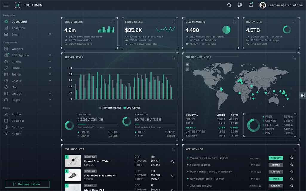
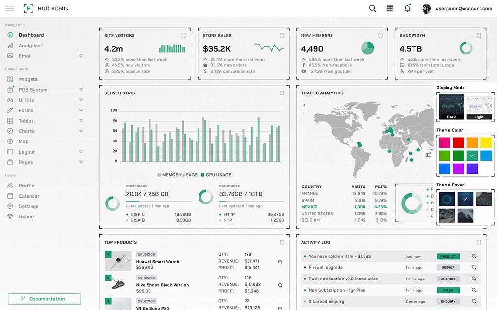
Bootstrap page header description goes here...
Alerts
Wrap any text and an optional dismiss button in .alert and one of the four contextual classes for basic alert messages.
Please read the official Bootstrap documentation for the full list of options.
Badges
Documentation and examples for badges, our small count and labeling component. Please read the official Bootstrap documentation for the full list of options.
Carousel
A slideshow component for cycling through elements—images or slides of text—like a carousel. Please read the official Bootstrap documentation for the full list of options.
Jumbotron
Lightweight, flexible component for showcasing hero unit style content by using Bootstrap utilities.
Hello, world!
This is a simple hero unit, a simple jumbotron-style component for calling extra attention to featured content or information.
It uses utility classes for typography and spacing to space content out within the larger container.
Learn moreList Group
List groups are a flexible and powerful component for displaying a series of content. Please read the official Bootstrap documentation for the full list of options.
Media Object
Media object is created by using Bootstrap utilities class and it is construct highly repetitive components like blog comments, tweets, and the like.
Media heading
Cras sit amet nibh libero, in gravida nulla. Nulla vel metus scelerisque ante sollicitudin. Cras purus odio, vestibulum in vulputate at, tempus viverra turpis. Fusce condimentum nunc ac nisi vulputate fringilla. Donec lacinia congue felis in faucibus.Pagination
Documentation and examples for showing pagination to indicate a series of related content exists across multiple pages. Please read the official Bootstrap documentation for the full list of options.
Progress
Documentation and examples for using Bootstrap custom progress bars featuring support for stacked bars, animated backgrounds, and text labels. Please read the official Bootstrap documentation for the full list of options.
Spinners
Indicate the loading state of a component or page with Bootstrap spinners, built entirely with HTML, CSS, and no JavaScript. Please read the official Bootstrap documentation for the full list of options.


