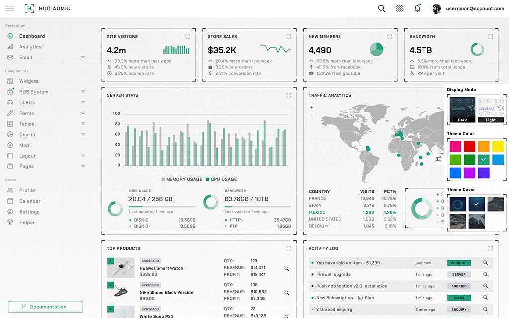
Card page header description goes here...
Basic Usage
Bootstrap’s cards provide a flexible and extensible content container with multiple variants and options. Please read the official Bootstrap documentation for the full list of options.
Card title
Card subtitle
Some quick example text to build on the card title and make up the bulk of the card's content.
Card link Another link- Cras justo odio
- Dapibus ac facilisis in
- Vestibulum at eros
Fullscreen (extended feature)
This is an extended feature from Bootstrap card. Add an attribute
data-toggle="card-expand" to any link or button to trigger
the maximize or minimize the card element
Card title
Card subtitle
Some quick example text to build on the card title and make up the bulk of the card's content.
Card link Another linkSizing
Cards assume no specific width to start, so they’ll be 100% wide unless otherwise stated. You can change this as needed with custom CSS, grid classes, grid Sass mixins, or utilities.
Special title treatment
With supporting text below as a natural lead-in to additional content.
Go somewhereImages
Cards include a few options for working with images. Choose from appending “image caps” at either end of a card, overlaying images with card content, or simply embedding the image in a card.
Card title
This is a wider card with supporting text below as a natural lead-in to additional content. This content is a little bit longer.
Last updated 3 mins ago
Horizontal
Using a combination of grid and utility classes, cards can be made horizontal in a mobile-friendly and responsive way.
Card title
This is a wider card with supporting text below as a natural lead-in to additional content. This content is a little bit longer.
Last updated 3 mins ago
Card Styles
Cards include various options for customizing their backgrounds, borders, and color.
Primary card title
Some quick example text to build on the card title and make up the bulk of the card's content.
Primary card title
Some quick example text to build on the card title and make up the bulk of the card's content.
Card groups
Use card groups to render cards as a single, attached element with equal width and height columns. Card groups use display: flex; to achieve their uniform sizing.
Card title
This is a wider card with supporting text below as a natural lead-in to additional content. This content is a little bit longer.
Last updated 3 mins ago
Card title
This card has supporting text below as a natural lead-in to additional content.
Last updated 3 mins ago
Card title
This is a wider card with supporting text below as a natural lead-in to additional content. This card has even longer content than the first to show that equal height action.
Last updated 3 mins ago
Grid cards
Use the Bootstrap grid system and its .row-cols classes to control how many grid columns (wrapped around your cards) you show per row. For example, here’s .row-cols-1 laying out the cards on one column, and .row-cols-md-2 splitting four cards to equal width across multiple rows, from the medium breakpoint up.
Card title
This is a wider card with supporting text below as a natural lead-in to additional content. This content is a little bit longer.
Last updated 3 mins ago
Card title
This card has supporting text below as a natural lead-in to additional content.
Last updated 3 mins ago
Card title
This is a wider card with supporting text below as a natural lead-in to additional content. This card has even longer content than the first to show that equal height action.
Last updated 3 mins ago
Card title
This is a wider card with supporting text below as a natural lead-in to additional content. This content is a little bit longer.
Last updated 3 mins ago
Card columns
In v5, cards can be organized into Masonry-like columns with masonry javascript included.
Card title that wraps to a new line
This is a longer card with supporting text below as a natural lead-in to additional content. This content is a little bit longer.
Lorem ipsum dolor sit amet, consectetur adipiscing elit. Integer posuere erat a ante.
Card title
This card has supporting text below as a natural lead-in to additional content.
Last updated 3 mins ago
Lorem ipsum dolor sit amet, consectetur adipiscing elit. Integer posuere erat.
Card title
This card has a regular title and short paragraphy of text below it.
Last updated 3 mins ago
Lorem ipsum dolor sit amet, consectetur adipiscing elit. Integer posuere erat a ante.
Card title
This is another card with title and supporting text below. This card has some additional content to make it slightly taller overall.
Last updated 3 mins ago


